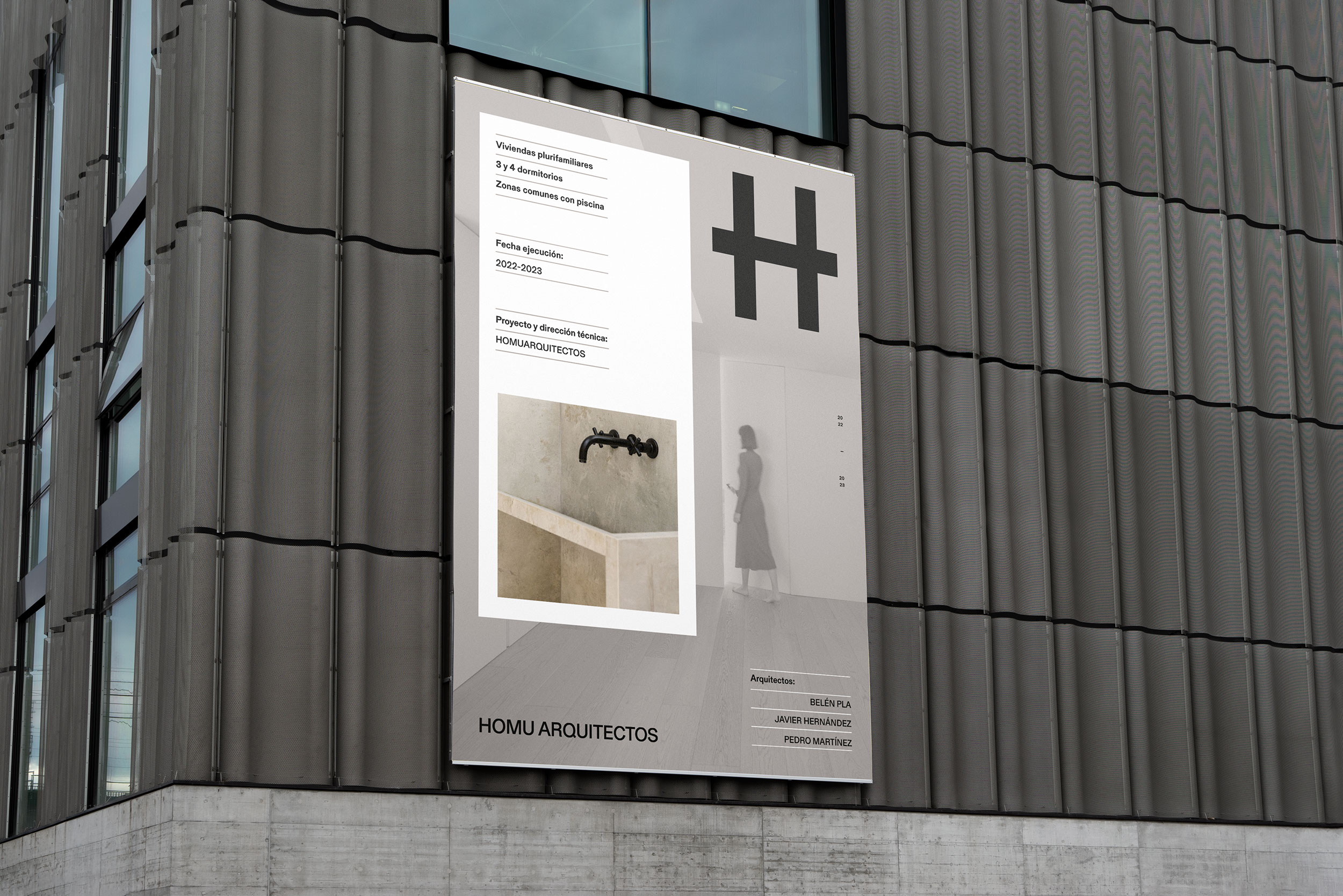
HOMU Arquitectos.
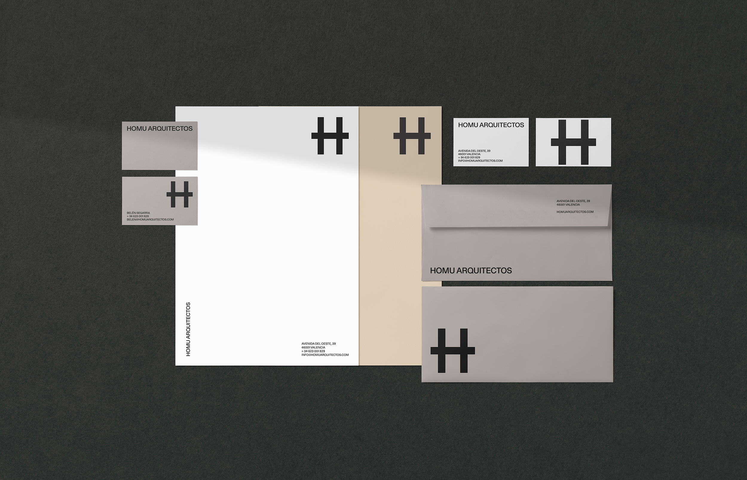
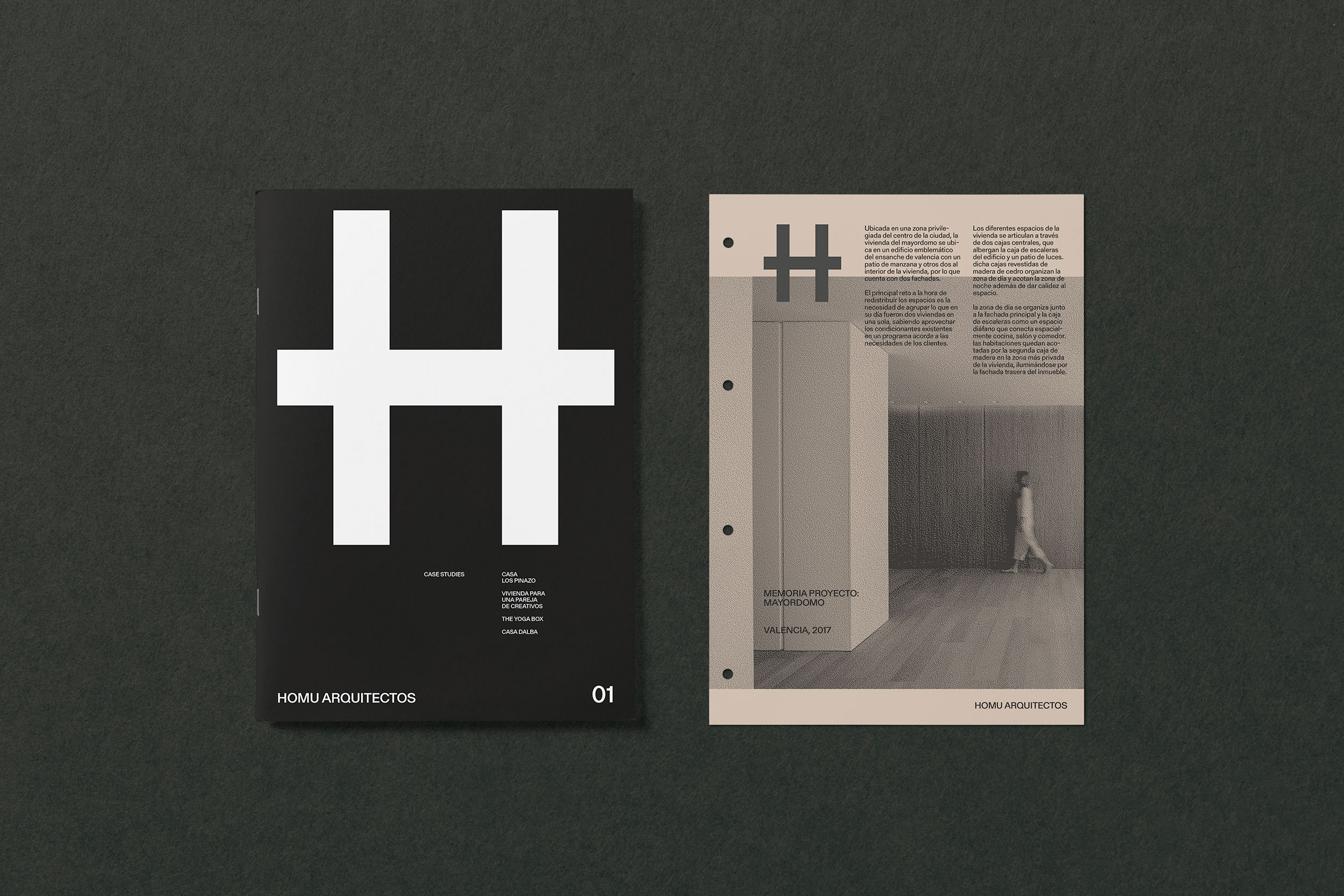
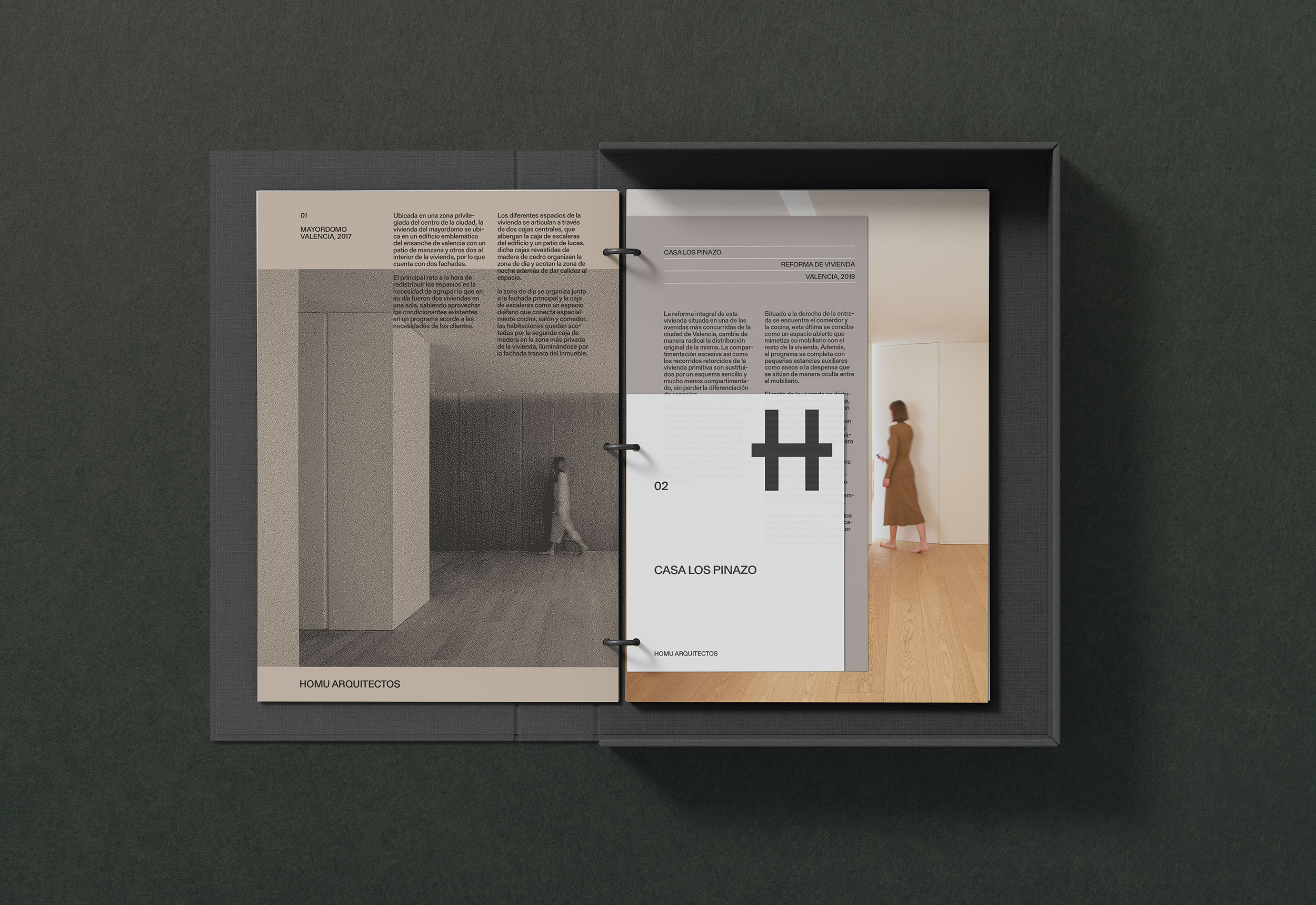
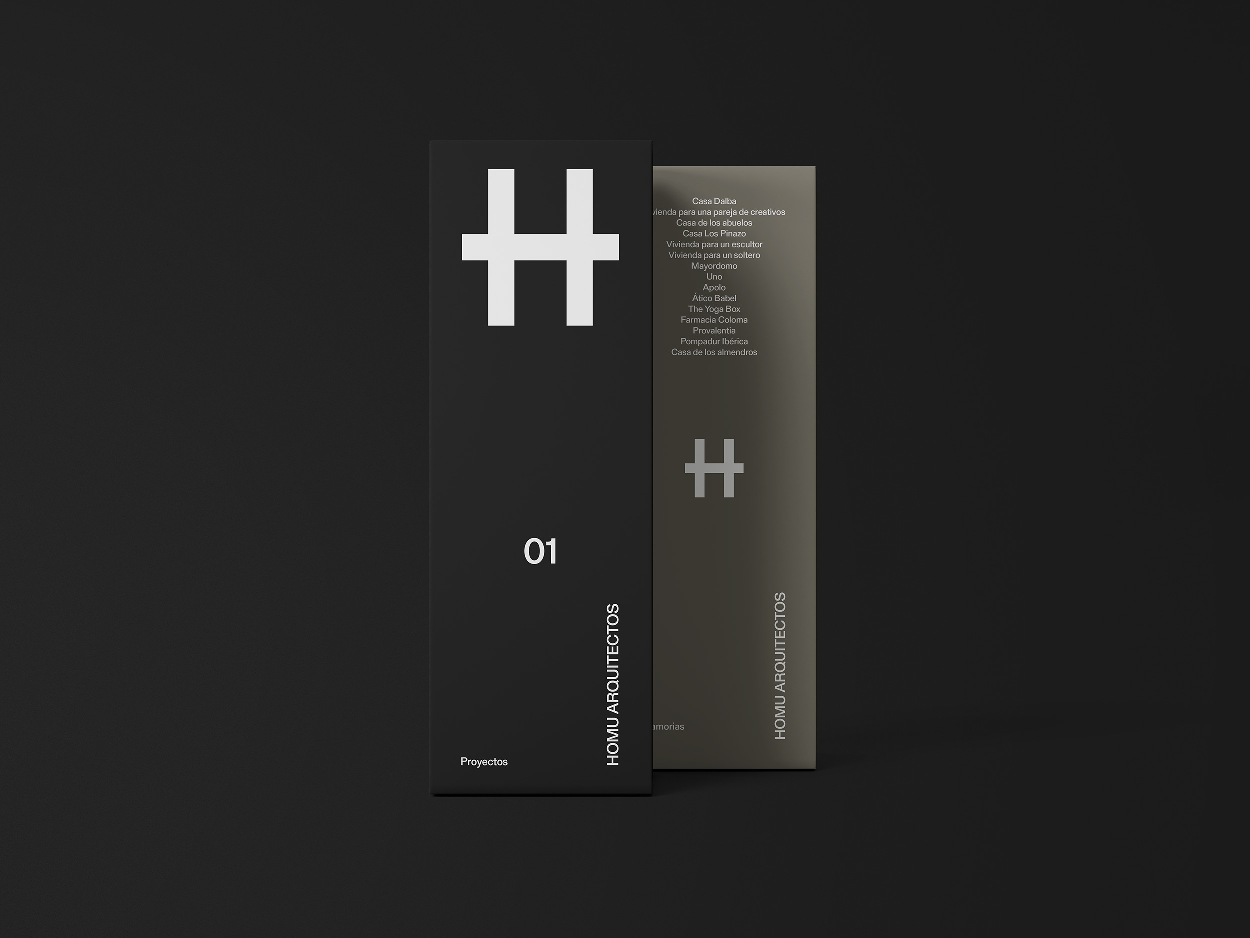
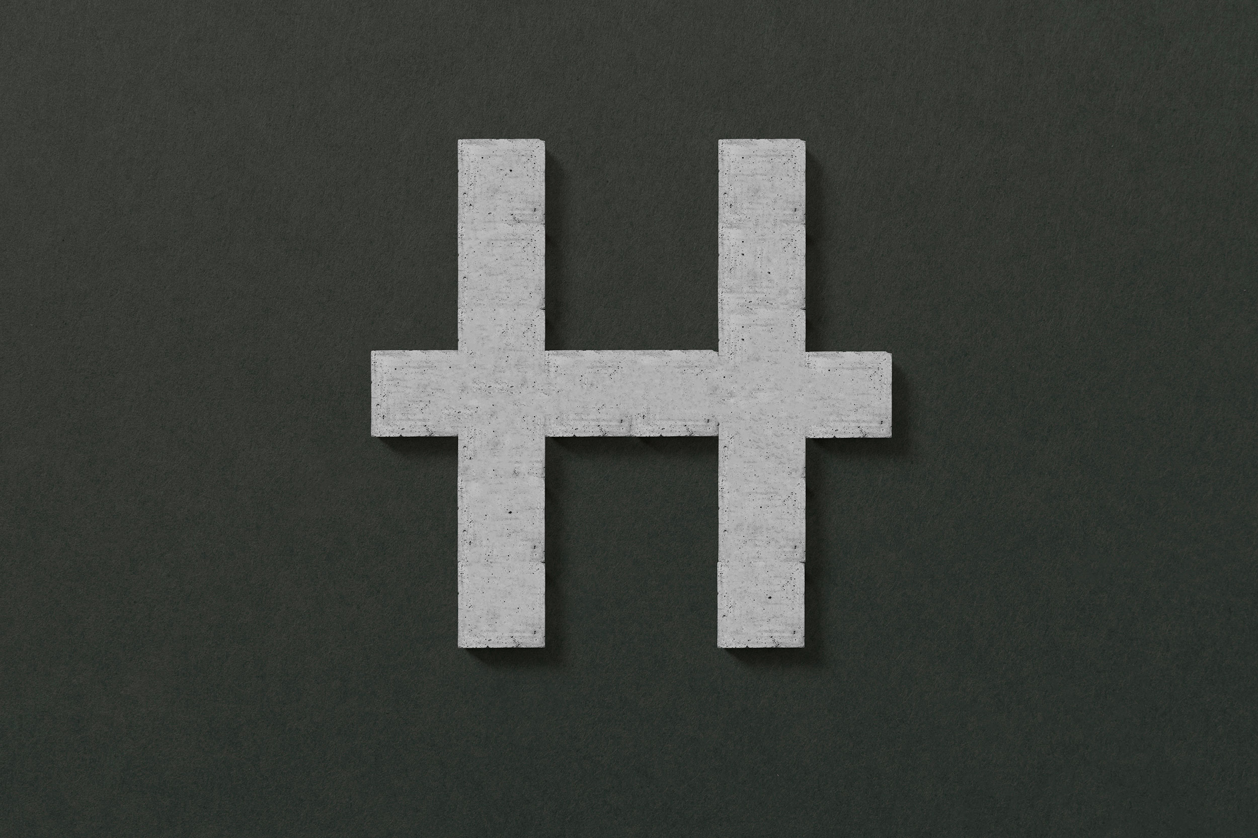
Homu means house in Japanese. The sign is an exercise in abstraction built from 3 identical strokes, as an ideogram of oriental writing, from the formal coincidence between the letter H and a construction of traditional Japanese architecture. The new symbol shows simplicity, normality and neutrality. It is applied in a proportionally large size compared to the rest of the elements of each support, generating a forceful presence of the identifying element.
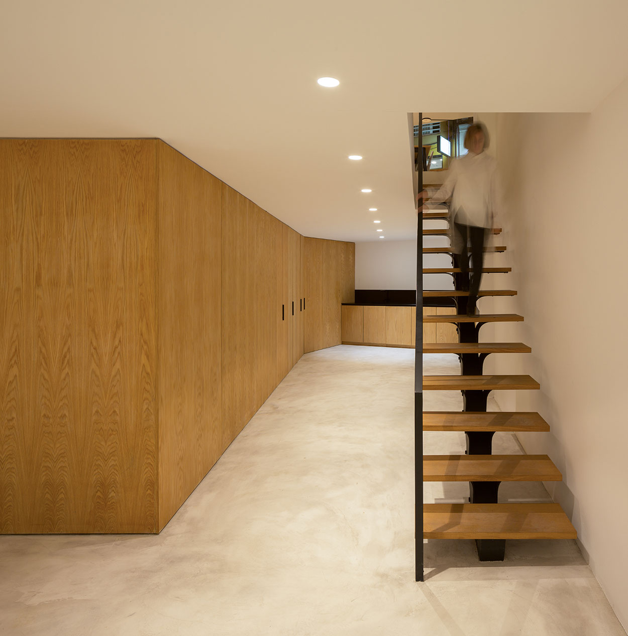
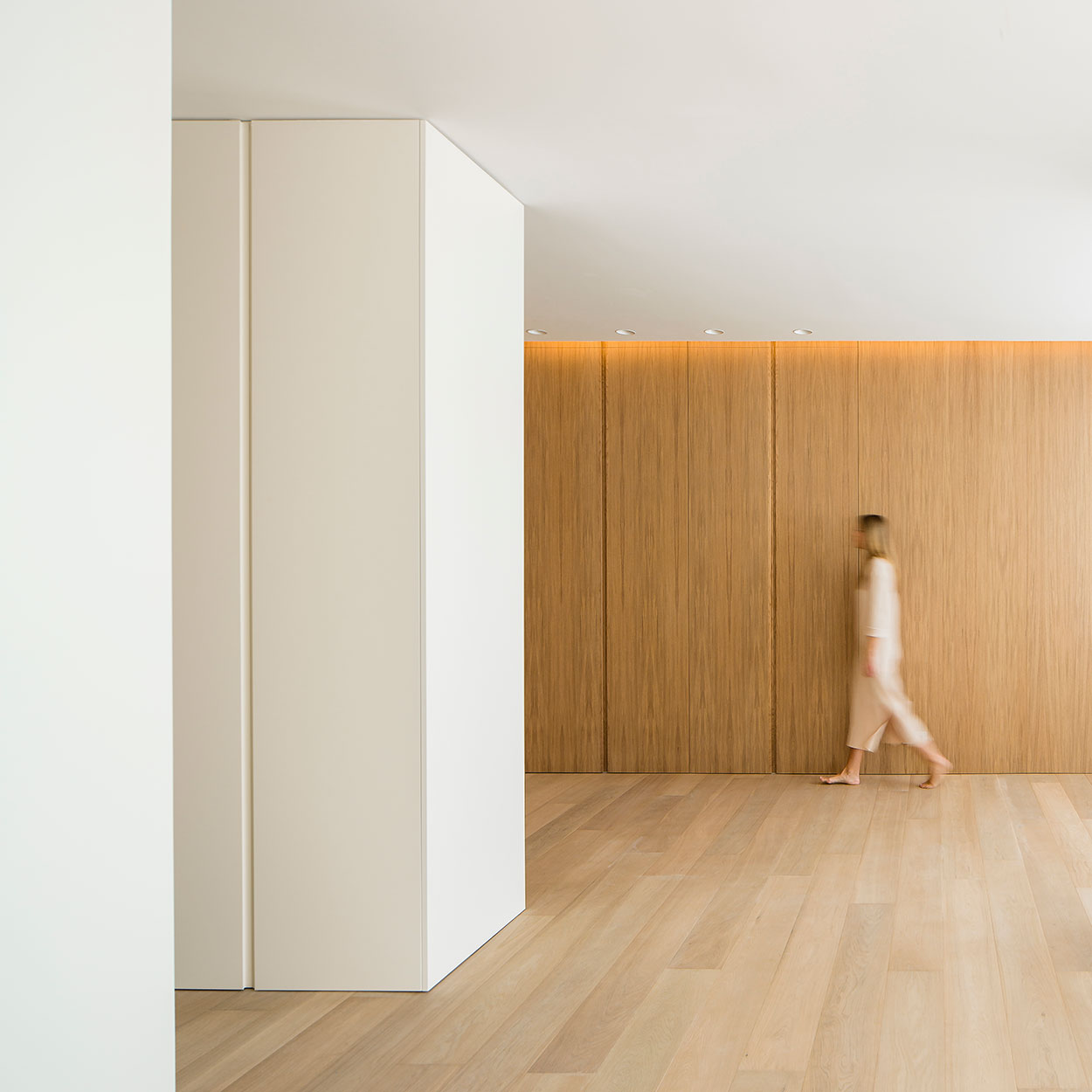
photography: Daniel Rueda.
Awards:
→ Finalist Premio ADCV 2024, Identidad corporativa.
